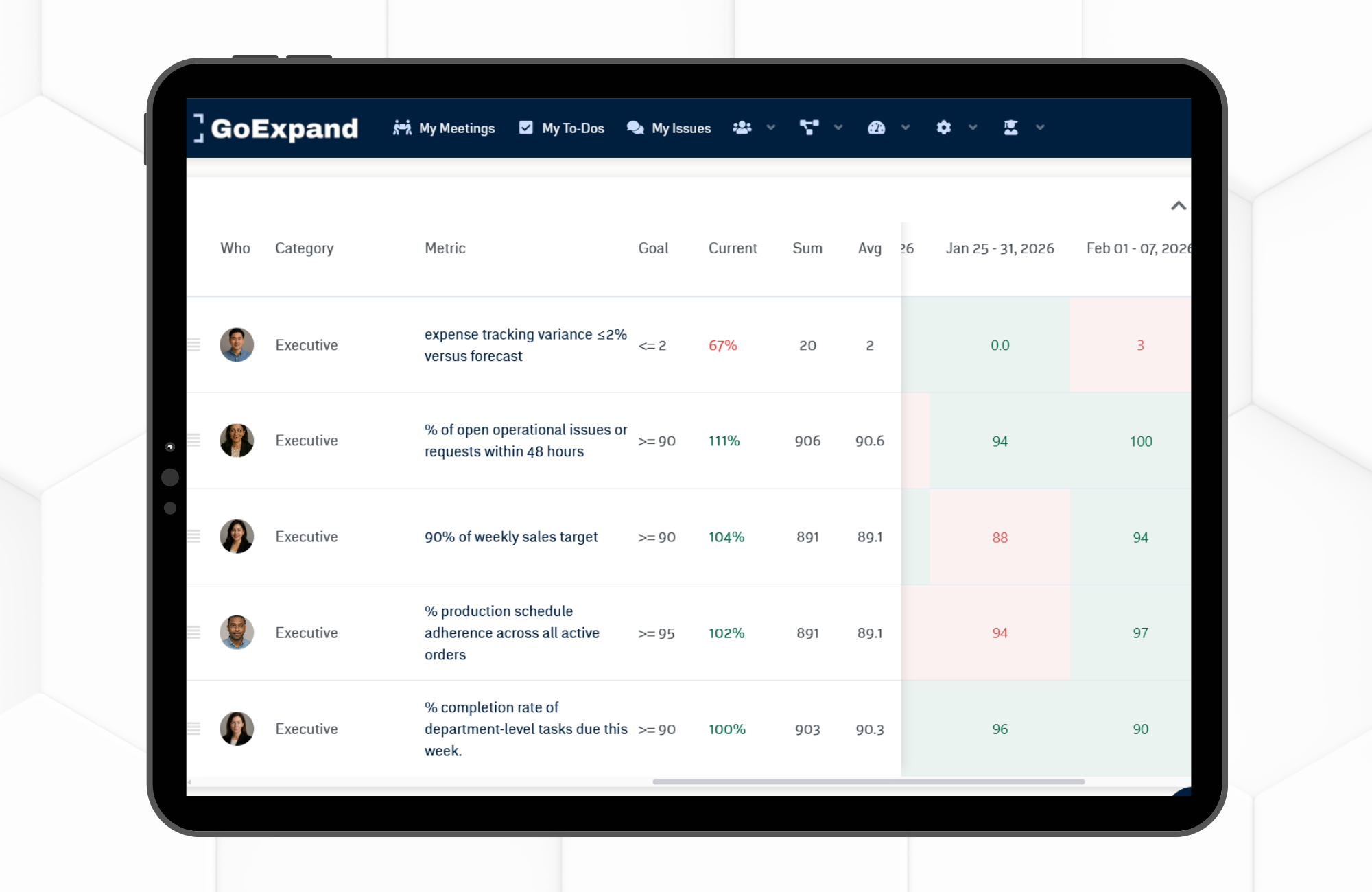
GoExpand meeting Scorecard showing leadership Metrics, weekly results, averages, and red-green performance indicators.
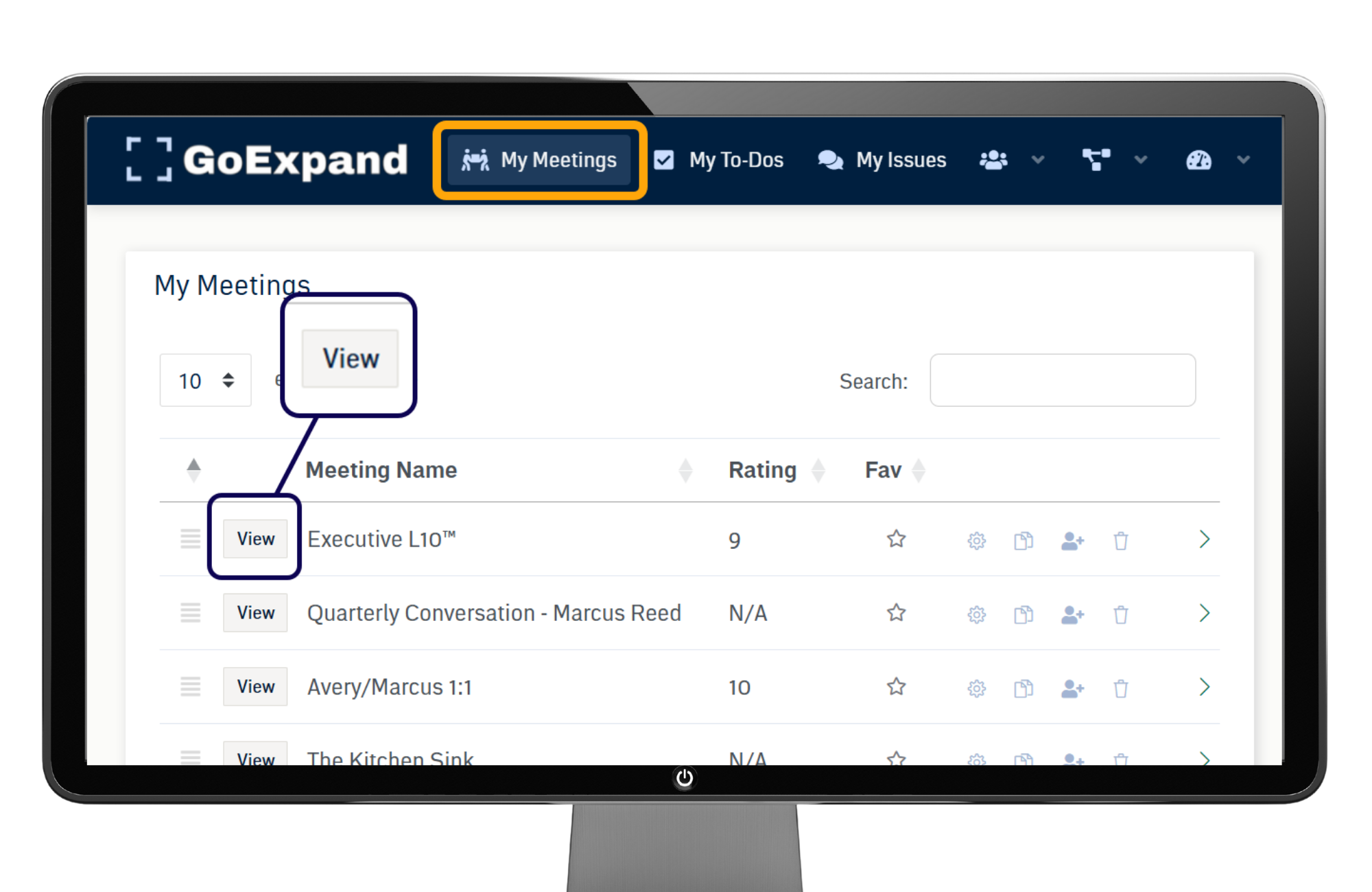
Navigate: Meetings → View Meeting → Scorecard
Metrics or Metric Categories can be added to your meeting agenda. Once added, you will see a new agenda item called Scorecard inside your Level 10 Meeting™.
When you reach the Scorecard section of your meeting, you will see the Metrics filtered by the meeting attendees who have accepted the meeting invite.
Scorecard Views: Mobile vs. Desktop
The Scorecard (not to be confused with dashboards or reporting views) displays differently depending on device size.
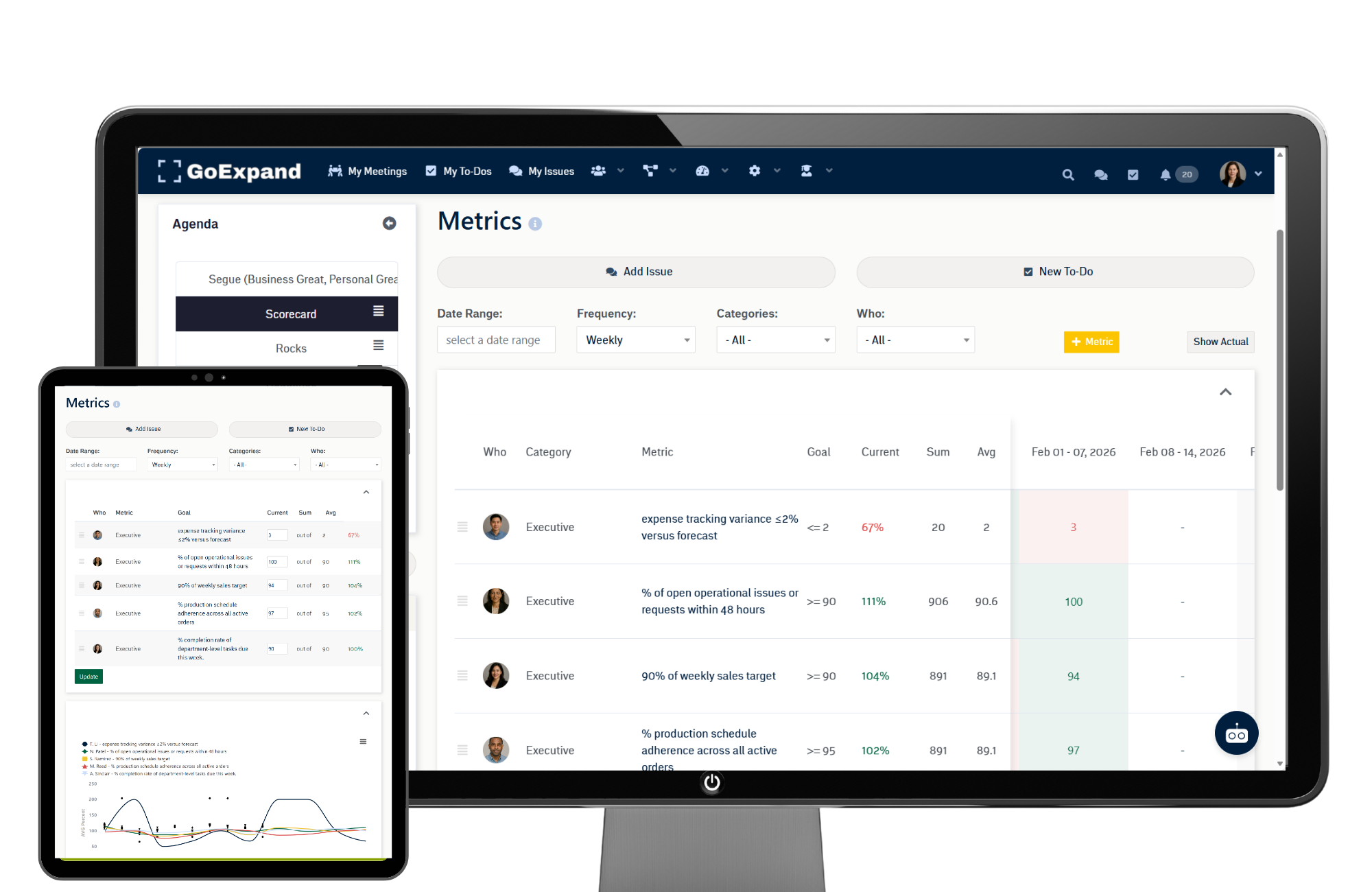
Mobile View
When viewed on a mobile device, the Scorecard displays the most recent data in a simplified table with an Update button at the bottom.
Desktop View
On larger screens, the Scorecard expands to show boxes for each weekly data point entered.
Important: Your user Seat must have the permission Edit Historical Metrics enabled to edit past entries in this expanded view.
Using Scorecard Filters
Above the Scorecard, you will see filtering options including:
- Date Range
- Frequency
- Category
- Who (Owner)
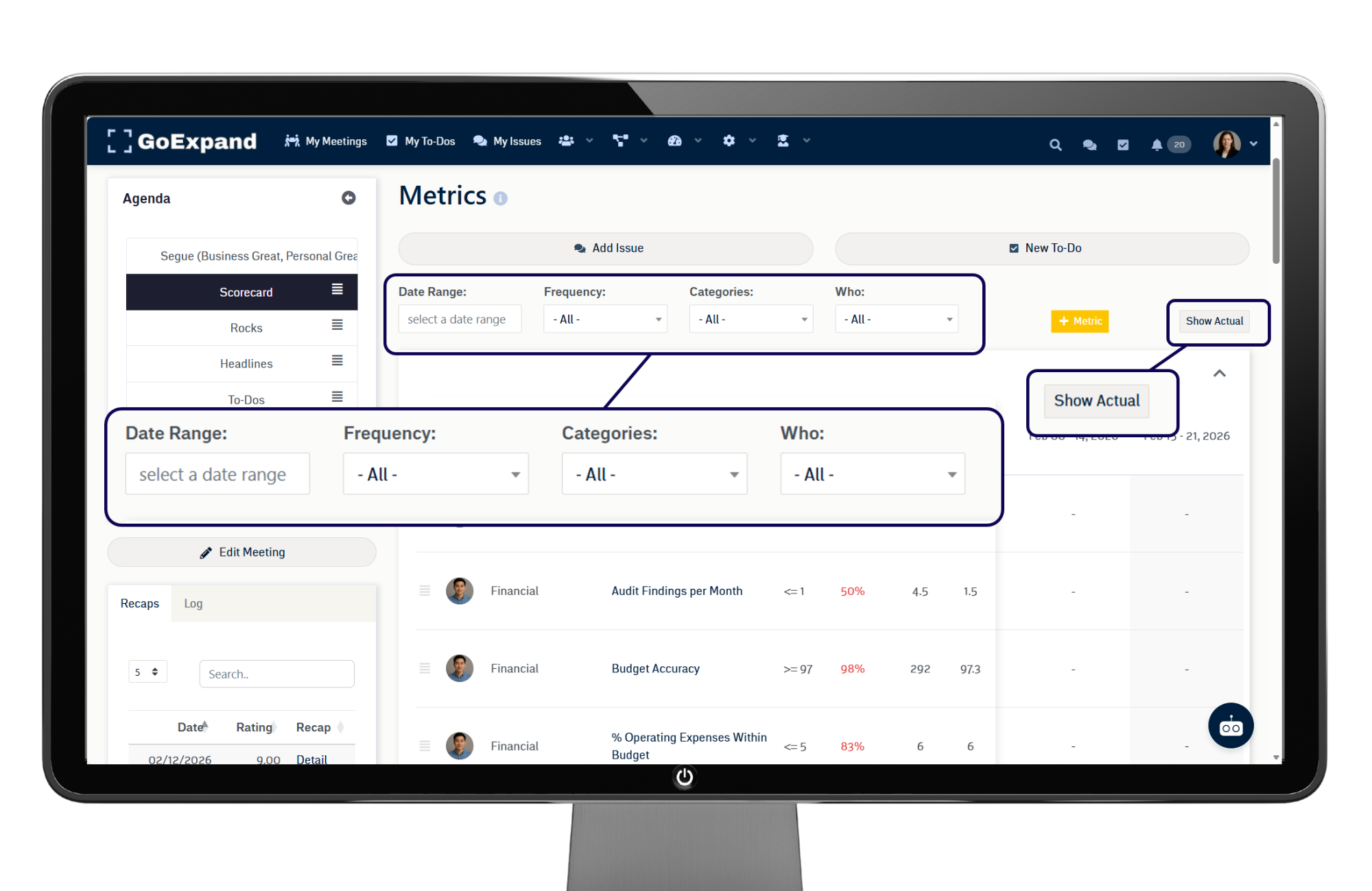
These filters allow you to quickly adjust the view and analyze different variations of your Scorecard data.
You can also toggle between:
- Actual values
- Percent values
The system automatically calculates the sum and average for the selected date range in each row.
Understanding Red & Green Indicators
Each column in the sliding table represents a week.
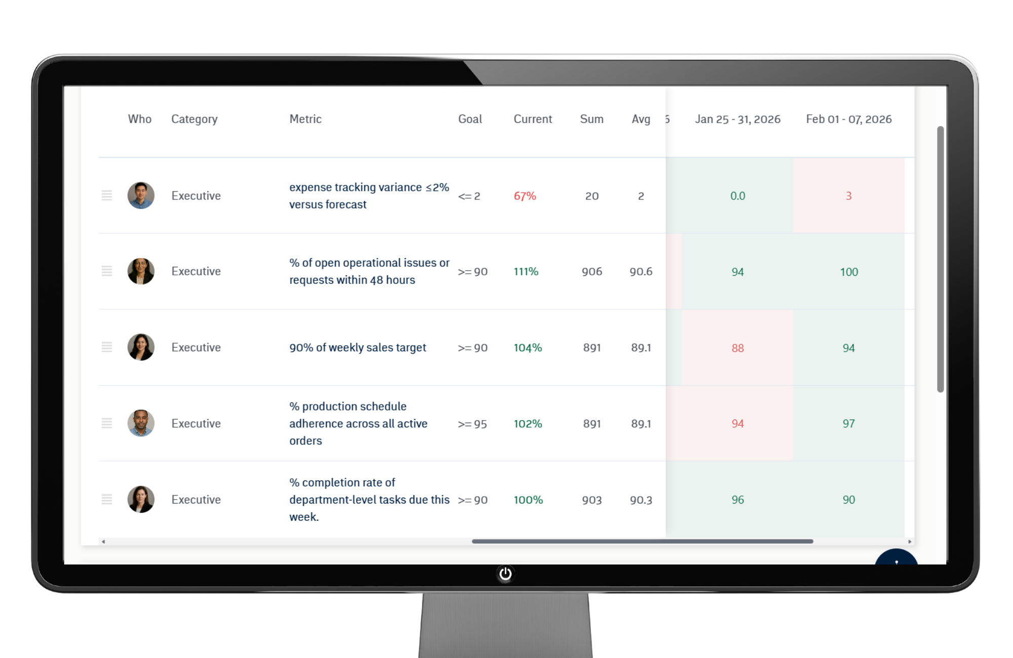
- When the value entered is equal to or greater than the goal, the cell turns GREEN.
- When the value entered is below the goal, the cell turns RED.
This immediate visual feedback helps leadership teams quickly identify which Metrics are on track and which need to be moved to IDS® for discussion.
Each time you click away from a table cell, the value is automatically saved — there is no separate Save button required.
Trend Chart
Below the Scorecard table, you’ll find a Metric Trend Chart displaying performance over time.
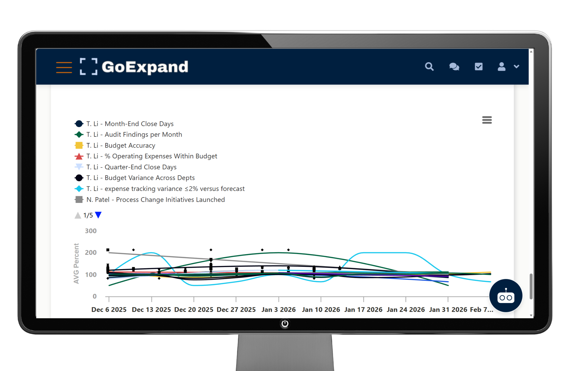
You can click and drag across the chart to zoom into a specific time period for deeper analysis.
This visual trend reinforces weekly accountability and helps leadership identify patterns instead of reacting to one isolated number.
See full Knowledge Base training article here.
>Up Next: Knowledge Base Express: Features, Tips & Tricks in GoExpand
Further Reading:
For more context on how scorecards, objectives, and meetings work together to drive performance, explore the resources below.
CIPD — Performance Management Factsheet (objective setting + feedback)
https://www.cipd.org/uk/knowledge/factsheets/performance-factsheet/
Harvard Business Review — The Balanced Scorecard (why scorecards drive performance)
https://hbr.org/1992/01/the-balanced-scorecard-measures-that-drive-performance-2
Harvard Business School Online — What Is a Balanced Scorecard? (plain-language explanation + how it’s used)
https://online.hbs.edu/blog/post/balanced-scorecard